How I Start
I'm beginning a design iteration of this site. I've started freelancing full time and I want the site to display more of my work and explain it in finer detail to give potential clients and collaborators a better idea of what I do and how I go about it. I love this early part of the process where everything is on the table, and up in the air, and I can get arty-farty and a little weird. Hold on tight, it's a bumpy ride.
Nonsense
This part of the process has no structure. I just like to make things as messy as possible. I immerse myself in the types of ideas I want to convey and the type of designer I want to be. I open 100 browser tabs across 10 different windows. I keep multiple sketch books in front of me, a No. 2 pencil and busted, cheap sharpener. I drag out every micron pen I have, even though I'll probably not use any of them. I haven't yet, but I'll probably get out the paint and brushes to make a really big mess.

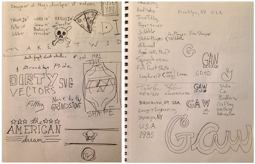
In my sketchbooks I don't really sketch interface wireframes, but I do write lots of words and phrases. Some of them are ideas I want to convey. Some of them are just nonsense that I think is funny. "Hollerin'" "Sweatin'" "Braggin'" "BLACK" "MAKE IT EXTRA LARGE" "NO STRAIGHT LINES" "ALL RIGHT ANGLES" "Don't limit" "Do limit" and plenty more non-sequiturs, contradictions, and fibs that will have me scatching my head when I look back at them at some point in the future. I also draw plenty of skulls on fire and anarchy signs and all other types of bad drawings that look awesome on the back of 8th grader's notebooks.
Folks
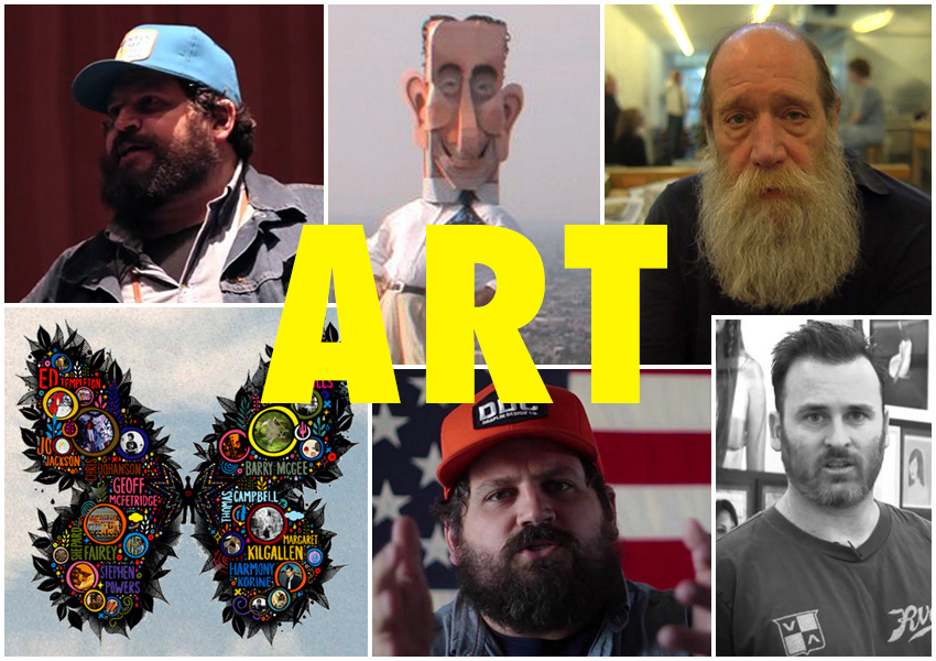
I listen to artists and designers talk about making cool art and design. I have seen all of these multiple times, they never get old. I love them and they get me excited to design:
- Portland/CreativeMornings - Draplin
- More Draplin - Tall Tales from a Large man
- Even more Draplin
- Draplin, shit! He's the best
- Design Matters: Lawrence Weiner
- Beauty is Embarrassing - Wayne White
- Beautiful Losers - Buncha great folks

With all of those it's not even really about the crud they make. I don't sit and stare at the work they produce. I get inspired and excited hearing them talk about how much they love what they do, what it means to them, and what they think it means to other people.
Letters and Such
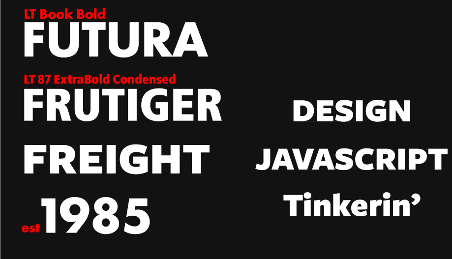
This time around I wrote names of different fonts that I was interested in using or just like the name; "Franklin Gothic Condensed", "Futura", "Roboto Slab", "Neue Helvetica 55 Roman".
I hopped into ole sparky (PS) and threw together some of the type to see how it would look in the colors I have in mind. Again, no structure, just bashing on the keyboard and tweaking some settings here and there to see how things might work later.

Music
Music is always a huge part of my process. A new Interpol song was released yesterday. It's awesome. I've listened to it about 999 times so far. It's having an impact on my brain and designs.
Here's some other crud I have on repeat that will also have an impact on the design:
- Our Love to Admire - Interpol
- ANTEMASQUE - ANTEMASQUE
- Burials - AFI
- From Parts Unknown - Every Time I Die
- Ultraviolence - Lana Del Rey
- Cry Is For The Flies - Le Butcherettes
- Once More 'Round The Sun - Mastodon
That's pretty heavy list. This design is most likely going to be dark, loud, bold, and brooding. Simple and clean can take a long walk off a short pier.
6th Grade Art Class
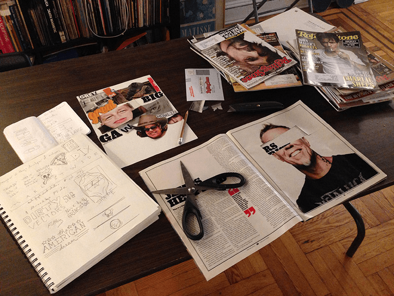
Here's something I haven't done for designs in the past, but felt compelled to for this one. I pulled out a stack of old magazines and have been tearing through them cutting things out to make crap little collages. I'm not putting much thought into the pieces. These aren't "mood boards" or whatever. Just flipping the pages and if something catches my eye I hack it out and throw it on some paper. A piece of text that's bright. Some dumb phrase. Creepy dude eyes. Anything that's interesting.

These collages aren't going to be part of the design, they're just a way for me to get moving. Computers are too damn slow. I need to use my hands to move fast and toss shit around and scribble and just be a wreck in general. It helps me get my entire self into it.
These Silly Paragraphs
This post is part of it too. This isn't meant to be some how-to or "10 Clever Ways to Inspire Your Next Responsive E-Commerce Design" post. Like the rest of the process, it's messy. It's unedited and maybe unfinished. It's also a chance to stop and think about what I'm doing. Or to put it another way; procrastinate.
What about you, how do you start?
Thanks for reading